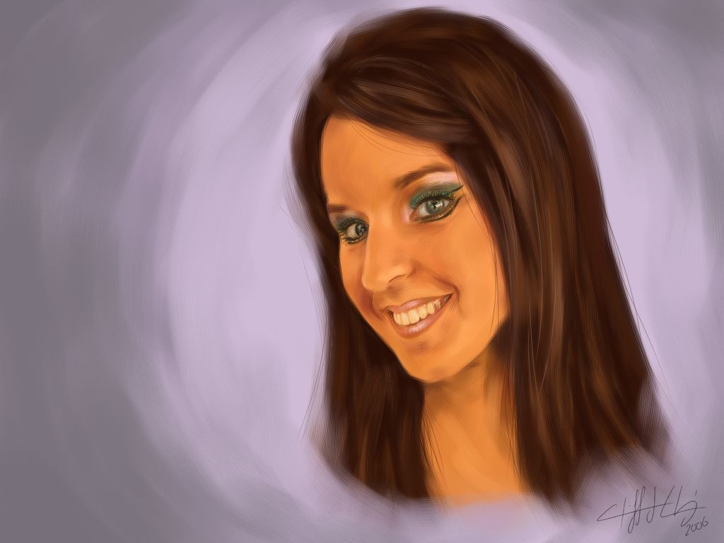
hey guys, here is my first "serious" painter piece.. although i did it mostly as an exercise in realism. i'm not really counting the painter pieces i did for michael hitchcox because i didn't really try on those... plus, i never really found the brush i wanted.
this is a painting of my friend kelly. as for likeness it's pretty good, only her eyes aren't as far apart as they are in the drawing.
any comments? they would be much appreciated...
cliff

9 comments:
Ooohhh, very pretty, Cliff. I really like the quality of the brush strokes. It's really excellent for your first serious painter piece. Good to see someone's still doing art this summer. Heh.
its pretty impressive, cliff...the background seems kind of boring though, like you didnt really feel like doing it. although the colour is nice around her face. is this kelly chasse from the summer?
-danielle
yeah it's kelly LOL.
the point of this painting for me was doing the face, so the background is super phone-in.
cliff
pretty cool for your first "real" attempt at digital painting. one crit that i can say is that the skin is a bit too orangy, maybe some cool color shadows to offset this? i dunno you're a much better painter than i am >_> but yea good stuff. i especially like the mouth and teeth (i always have trouble realistically rendering teeth and stuff)
nice. pretty impressive for your first attempt in painter. but wad can i say u are always good with traditional =P i would say that everything is too soft and rendered in this piece that there isnt enough balance of crispness to make the piece a bit more interesting? maybe on the hair ? or add a tiny bit of highlights as glows on her face. =) ne ways good job glad to see ur doing art in the summer too =P
nice attempt at realism digital painting Cliff =)~~ I agree with Ed and Lettie's comments.. I guess my input would be that perhaps you could push your values more to get more depth and interest.. there are perhaps areas of her face or hair that you could have highlighted more and brought out.. and other parts you could have made darker.. I realy like what you did with the eyes, mouth and teeth =) I look forward to seeing more art from you this summer ^^
pretty! The only thing I'd have to point out that hasn't been said yet, is that I don't particularily like the brush you used on some parts of her skin- the rough small textured lines- they look like very fine wrinkles (particularily around her eyes) and make her look a bit wrinkly and old. If that was the effect you were going for, than that's cool, but I think you were going for brush-texture interest. I'd try a different brush for that.
That's all I have to point out. Otherwise it looks pretty slick! You're the realism master!
thanks for the comments..
ed: i know it's too orange; the photo i used was very orange (it was taken indoors under very yellow light) but i just followed the photo's colours. i'll know next time to make it less orange!
lettie: i am aware of the fuzziness. i am still looking for a detail brush which will give me a nice clean look. i haven't had time to custom make one yet (i customised the one i used in the painting, but it's more bristly.)
jinny: thanks for the comments. i will keep that in mind. i was trying to emulate the photo; it didn't have as much contrast in it as i would have liked, so that's why it seems like it's a bit flat, i guess!
sarah: like i said before, i am still looking for a detail brush to give me a very clean, realistic look. i don't want things to look completely airbrushed, so i tried to keep a bit of a texture in the brush... but obviously for small parts (like the eyes and such) the bristles really show, and it doesn't look the greatest.
so i'll keep these things in mind the next time i do another painting! although it might not be for another while. thanks!!
cliff
...really good! yes, maybe some highlight on har face and a little on hair too... it would make it come out from the background, and make it more impressive.. anyway, you did a freat work, the brush stroke is perfect!
it all looks really...natural!
Post a Comment